WorkPain With No Scars
Pain With No Scars. A safe place to read and to share.
Pain With No Scars helps survivors of abuse and trauma. Survivors can send in their stories. Someone reads each one before it goes live. A Quick Exit is one tap away on every page.
The live site. Scroll it right here.
This is the about page. The survivors' stories stay on their site, so we do not show them here.
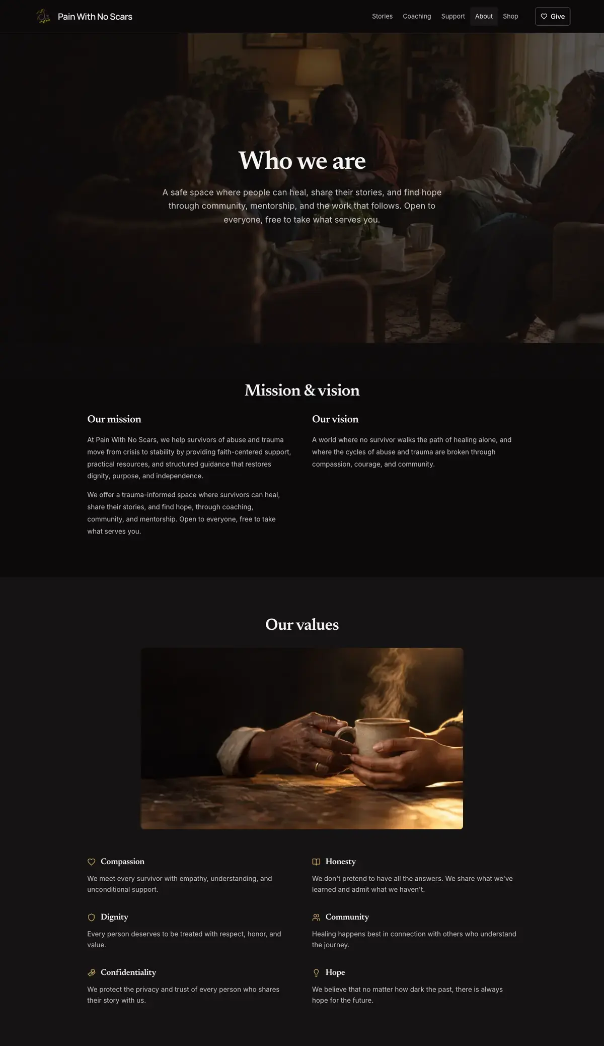

The painwithnoscars.org about pageScroll the page to scroll the site.
Built for a reader on a bad night. A safe way out on every page.
Before
- A page that reads like a brochure fails that reader.
- Stories need someone to read them before they go live.
- The brand red was too faint for small text.
Now
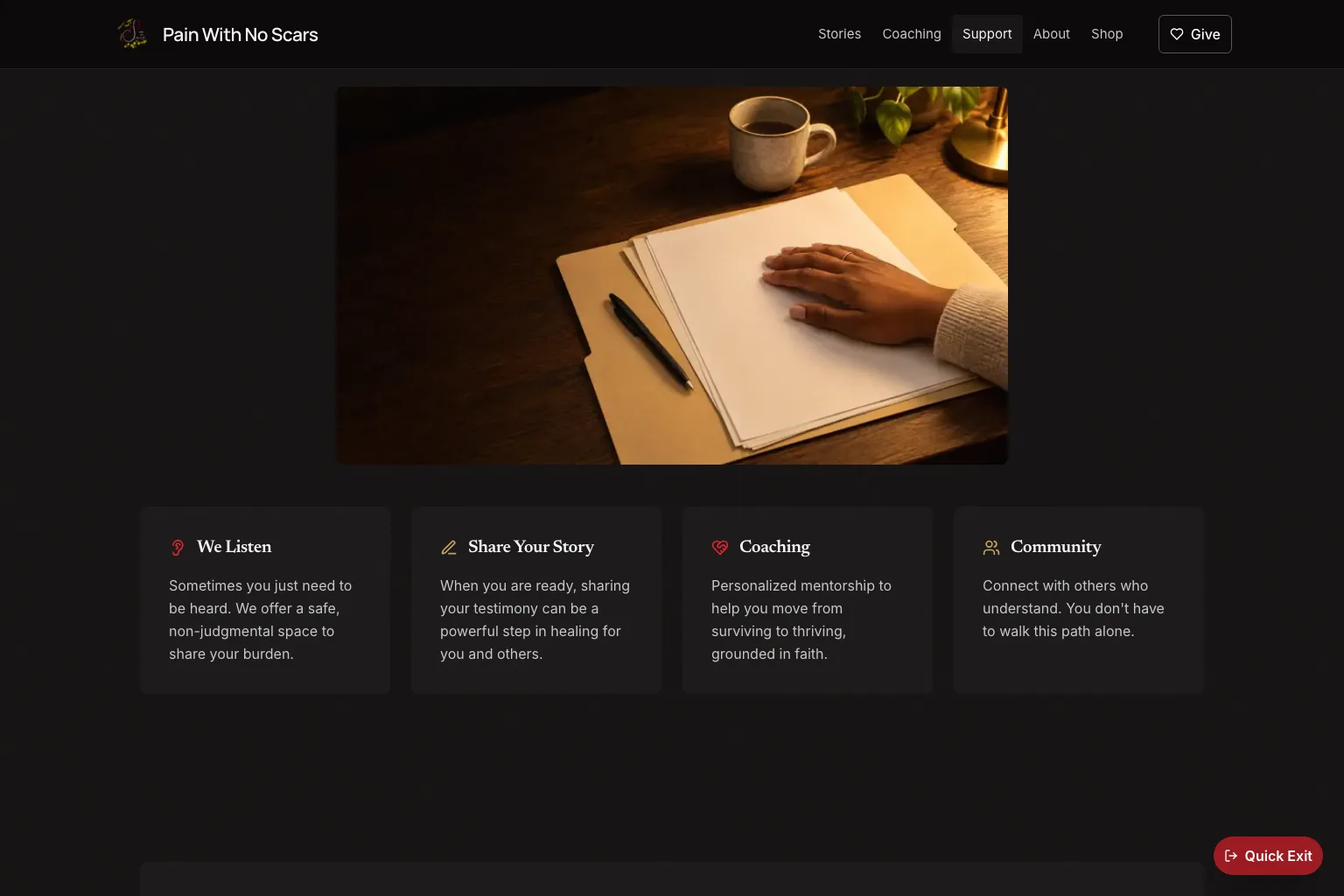
- A Quick Exit button is on every page. It stays in view as you scroll.
- Someone reads each story first. The writer's name stays off unless they ask.
- Links use a gold that is easy to read.
The brief. What it had to do.
Pain With No Scars, Inc. is a Florida 501(c)(3) nonprofit for survivors of abuse and trauma. Natacha Alcindor founded it. We built painwithnoscars.org. It has the public site, a way to send in stories, coaching, past events, donations and a shop. Someone reads each story before it goes live. Natacha runs it all from her own admin page. Every page has to be safe. So the Quick Exit, the crisis notice and the content warnings are built into the layout of every page. Live at painwithnoscars.org.
The group had a founder with a story and a mission. Its readers might open the site on a bad night, with someone watching over their shoulder. A page that reads like a brochure fails that reader.
Survivors' stories need someone to read them before they go live. Writers need a way to stay anonymous. The brand red measures 4.24:1 on the dark background, which is too faint for small text. And the group is not an emergency service. The site has to say so, and keep the crisis numbers in view.
What it had to do
- Give survivors a place to read and share stories. A person approves each story before anyone else can see it.
- Take donations and sell Natacha's books from the same site.
- Let Natacha run stories, events and posts on her own.
- Meet WCAG 2.1 AA, the main web standard for people with disabilities. Keep a Quick Exit in reach on every page, at any point as you scroll.
What we had to work around
- WCAG 2.1 AA on every page, and nothing that flashes.
- A Quick Exit on every page that stays in reach as you scroll.
- A person reads each story before it goes live. Stories go up without a name unless the writer asks for one.
- The brand red stays on buttons, the logo and large headings. It never colors small text.
- The crisis notice names 988. It says the group is not an emergency service. It sits in its own box.
What we built. Open it and check it.
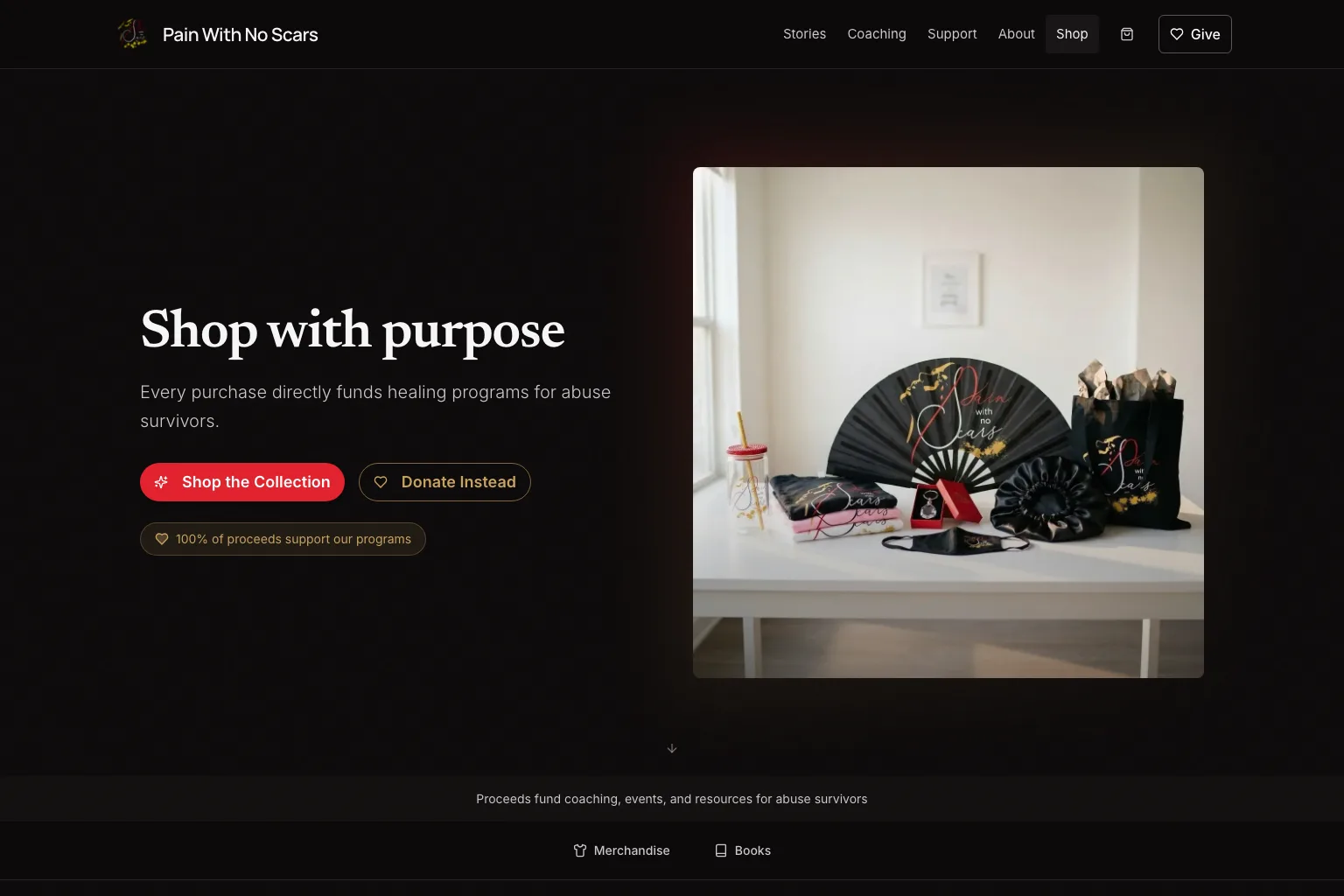
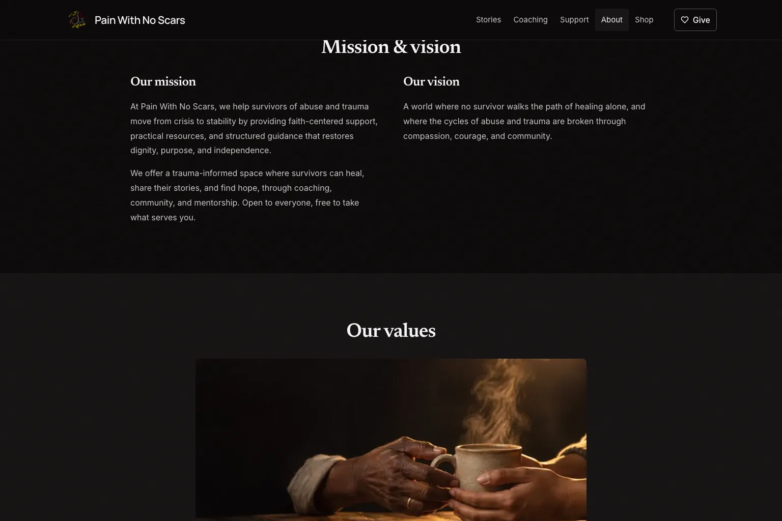
- 01A public site with 19 sections. They include about, stories, coaching, events, resources, support, donate and shop. There is also a blog, FAQs, get involved, contact and the legal pages.
- 02A way to send in a story. Each one waits in a queue until a person approves or rejects it. It goes up without a name unless the writer asks.
- 03An admin for stories, events and blog posts. Natacha signs in with her email and a password.
- 04Donations go through Stripe. The shop runs on Shopify but shows in the site's own design.
- 05The server checks each form for spam bots before it saves anything.
- 06A style guide with the measured contrast of every color pair. A check kept in the code makes sure the site follows it.
The calls we made. And why.
- 01
Where does the crisis notice sit?
In its own box, with its own colors. It uses neither the brand gold nor the button red.
Why
A notice that says to call 911 must not look like a highlight. It must not look like one of the group's own buttons either. So it gets a dark alert box, a red border and an icon at 7.13:1. Every page that needs it shows the same notice.
- 02
What color are links if the brand red is too faint?
Links are warm gold at 8.35:1. The red keeps the buttons, the logo and large headings.
Why
The red is the brand, and it is not ours to change. We worked out a lighter red and turned it down. White text on it was too hard to read. It would have been a near copy of the real red.
- 03
Testimonials or stories?
Stories. Each one is a person's own account of what happened to them. Someone reads it before it goes live. It has no name on it unless the writer asks.
Why
A testimonial says a product is good. A survivor who writes about what happened is praising nothing. Each story waits in a queue. Natacha reads each one before a stranger can.
- 04
One system for all of it, or several?
One. Convex holds the data, the sign-in, the server code and the files. We moved it there from Supabase in June 2026.
Why
The admin, the story queue and the public forms all save to one place. The spam check runs in the same step as the save.
Measured outcomes.
Each figure comes from the build or from the client's own checks. Its source sits beside it. The client has not given us a business result, so we show none.
How it went. Step by step.
- Dec 2025First buildWe built the pages, the story and support forms, and the admin. Every public form got a spam check. Resend sends each entry by email.
- Mar 2026The shopA shop that runs on Shopify, in the site's own design. Natacha's books are back in it.
- Jun 2026One systemWe moved from Supabase to Convex. The data, sign-in, server code and files now live in one place.
- Sep 2026Redesign and launch checksWe redesigned the site in four rounds. Each round covered computer, tablet and phone. We added the style guide with measured contrast. The server now checks every public form before it saves.
Built with
- Next.js
- Convex
- Stripe
- Shopify Storefront API
- Resend
- Cloudflare Turnstile
- Vercel



Julio DiazFounder
Christian MoranOperations & Client Support
Get your free AI Plan. We write it. Then we build it and run it.
Tell us about your business and talk with Maya or one of us. Within 48 hours, we walk you through your written plan. It is free, and it says what not to buy.