WorkNatacha Alcindor
Natacha Alcindor. A site a family can use on a phone.
Natacha is a coach, a speaker and a farewell planner. One site holds all three. We built it for a family who reads it on a phone at 2am.
The live site. Scroll it right here.
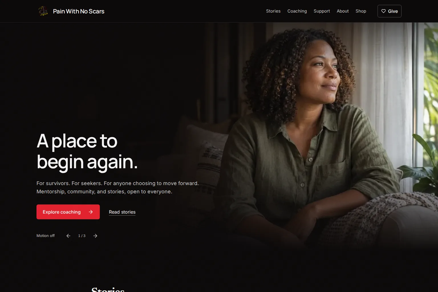
This is the home page today. Her photos and her words are her own.
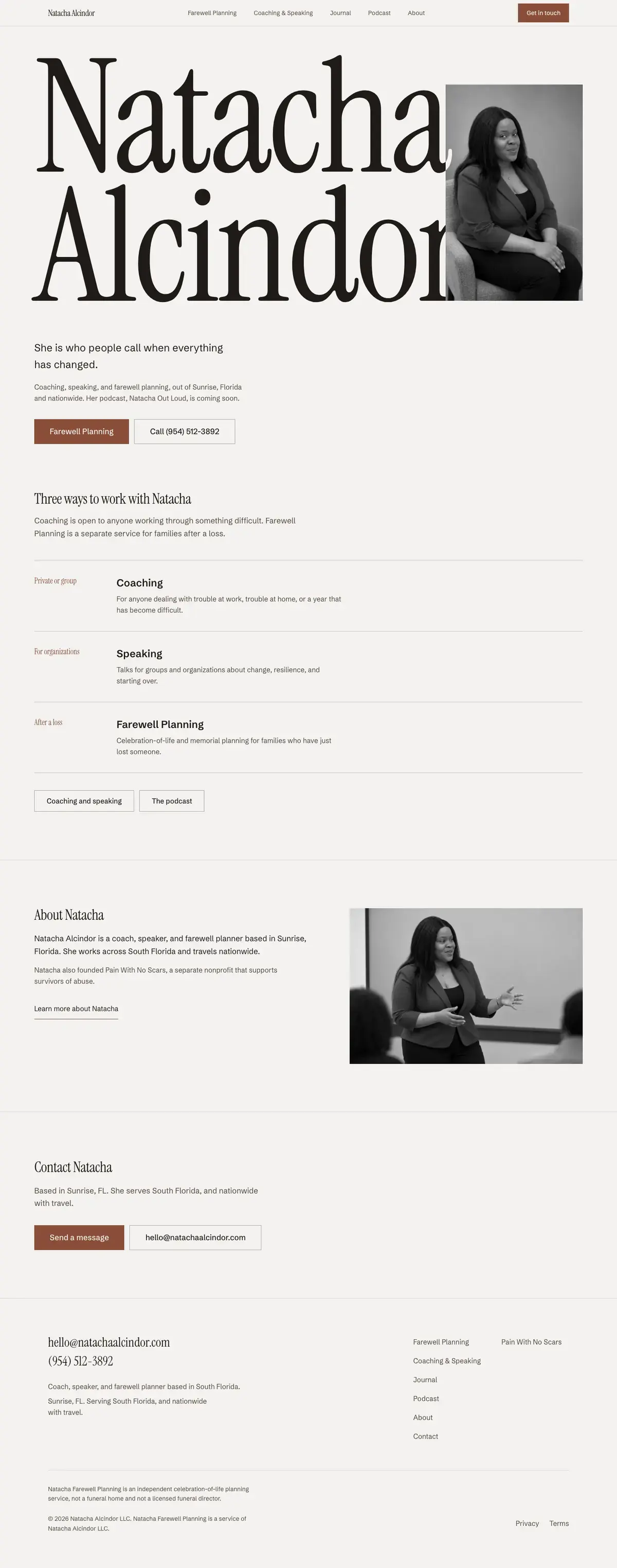

The natachaalcindor.com home pageScroll the page to scroll the site.
Three equal cards. Now a running order.
Before
- The first version looked like every quick site.
- The home page had three equal cards.
- On a phone, the section menu was gone.
Now
- A running order takes the place of the cards.
- Each row has a label, a heading and one plain line.
- Tap targets pass on every page at phone width.
The brief. What it had to do.
Natacha Alcindor LLC runs three lines of work from one site: Farewell Planning, coaching and speaking, and the Natacha Out Loud podcast. We launched the first version in July 2026. In September we rebuilt it with a new page plan, a new look and new photos. The brief in one line: a family searching at 2am on the worst night of their life should call her, not the funeral home down the street. Live at natachaalcindor.com.
The first version loaded fast, and all its text was easy to read on its background. But it looked like every site an AI tool makes. It had a cream background and her name in italic type. A small label in capitals sat over each heading. The home page had three equal cards.
The page that brings in her income had a menu for its sections. On a screen smaller than a computer's, that menu was gone. Nothing took its place. A family on a phone had no way to move through the page. Every photo was also smaller than the space it filled on screen.
What it had to do
- Make the Farewell Planning pages easy to use with one hand on a phone. That is how a grieving family reads them.
- Drop the stock layout of the first version: the split top section, the three equal cards and the same closing band on every page.
- Give her personal brand and Farewell Planning each their own look. Never add a third.
- Keep her prices, legal wording and page addresses as they were.
What we had to work around
- Her prices, legal wording and page addresses stay as they were at first.
- Two looks only, never a third.
- Natacha is the only person in any photo. We never made up a person to stand beside her.
- Motion stays simple and uses only what the browser has built in. Nothing takes over the scroll. No heavy graphics code runs.
- Her bio, service and legal text stays as she approved it.
What we built. Open it and check it.
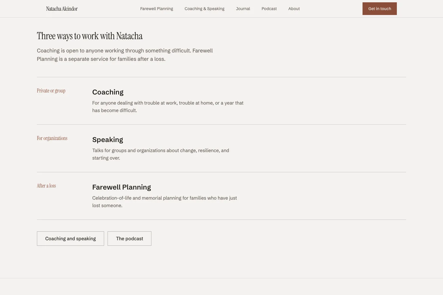
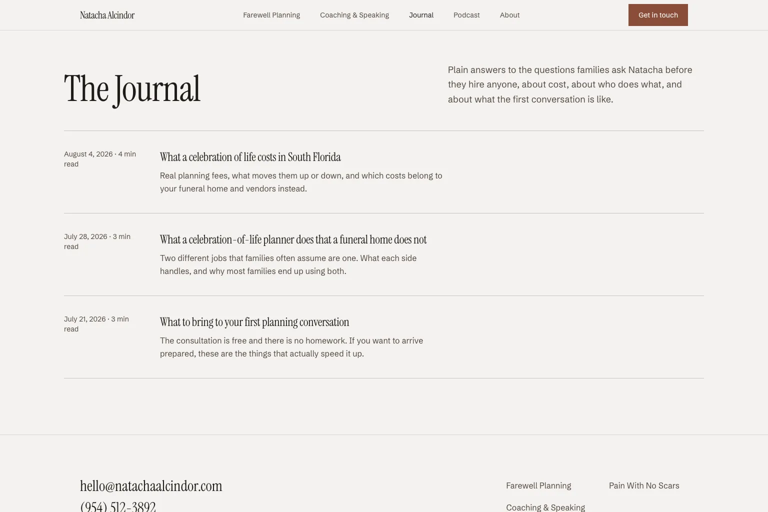
- 01The site has seven pages. They are home, about, coaching, podcast, journal, contact and Farewell Planning.
- 02A dark look for her personal brand: a near-black background and off-white text, with her red as the only accent color.
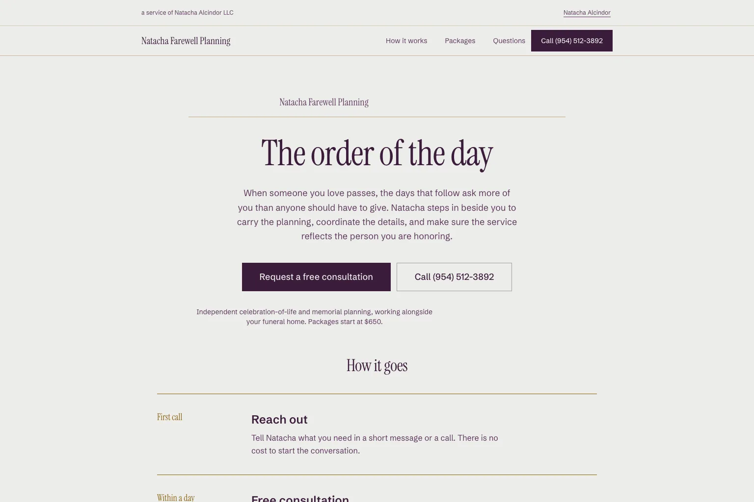
- 03A paper look for Farewell Planning: a cool grey background, plum text and thin gold lines. It is set like a printed memorial program.
- 04The running order: rows split by thin lines. It takes the place of every grid of cards.
- 05We made the photos with AI from 29 real photos of Natacha. One approved photo guided every image. The same words about her went into every request. That way she looks like herself in each one.
- 06Four forms that run through one piece of server code. A spam check guards them, and Resend sends the email. A test opens every page in a real browser at 1440 and 390 pixels wide.
The calls we made. And why.
- 01
How does a grieving visitor know they have reached a calmer place?
The colors change. Farewell Planning moves from the near-black look to the pale paper look. Its plum comes from her real logo.
Why
The color change is the signal. We took cream out on purpose. Cream is the default background of AI-made layouts, and leaving it behind was the point of the rebuild.
- 02
Cards or a running order?
A running order. Each row has a stage label, a heading and one plain sentence. Thin lines divide the rows.
Why
The name comes from the order of a memorial program. Where a draft wants three equal cards, it gets a running order. We also banned the small label above a heading.
- 03
Real photos, or made with AI?
We made them with AI from 29 real photos of her. One approved photo guided each image after it.
Why
Every request uses the same words to describe her. That keeps her face, skin tone and build the same in each photo. Later, a real photo can take the place of any image. The layout stays as it is.
- 04
Does a site with seven pages need a database?
No. The pages are built ahead of time. One piece of server code handles the four forms, and Resend sends the email.
Why
A database would be one more thing to run. This site's job is to be read at 2am and send one message.
Measured outcomes.
Each figure comes from the build or from the client's own checks. Its source sits beside it. The client has not given us a business result, so we show none.
How it went. Step by step.
- Jul 2026First versionThe plan was approved, and we built the site in one pass: three lines of work, seven pages and four forms.
- Jul 2026LaunchHer own web address went live on 22 July, sixteen days after kickoff. Sending email from the site was set up and checked the same day.
- Aug 2026Photos and the JournalNew photos for the site, and The Journal. It holds her long articles on how families get quoted.
- Sep 2026The rebuildWe agreed on the plan for version two on 16 September. It went live the same day. It brought two looks, the running order, new photos and new text.
Built with
- Next.js
- Resend
- Cloudflare Turnstile
- Cloudflare DNS
- Vercel


Julio DiazFounder
Christian MoranOperations & Client Support
Get your free AI Plan. We write it. Then we build it and run it.
Tell us about your business and talk with Maya or one of us. Within 48 hours, we walk you through your written plan. It is free, and it says what not to buy.